CASE STUDY
Electric Dusk website redesign
Electric Dusk is a Drive-In movie theater located in Los Angeles, CA. The drive-in experience offers a unique and fun night out for family or friends. They show new and old films, plus provide concessions.
- About the project: This was a project for General Assembly UI/UX Design Immersive.
- My role: I was the main UI designer and also conducted user interviews as part of UX research.
- Team: Reed S., Caroline C.
- Tools Used: Figma, Maze, Photoshop
- Timeline: 4 weeks
The Problem: Moviegoers are having a hard time navigating the website and purchasing tickets
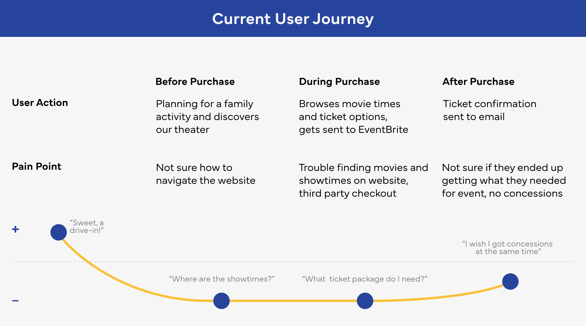
Empathize: USER Interviews
Understanding the moviegoers current experience
We conducted five user interviews. These people identified as frequent moviegoers. We asked them to complete several tasks on the current website. These tasks included finding a movie trailer, purchasing a ticket, and finding showtimes.
Key takeways from the user interviews
- They were overwhelmed with the amount of (visual) clutter. Navigation was a chore.
- They wished fees were included in the ticket options.
- They preferred that concessions be included inside the checkout process.
- They like to checkout without having to make an account.
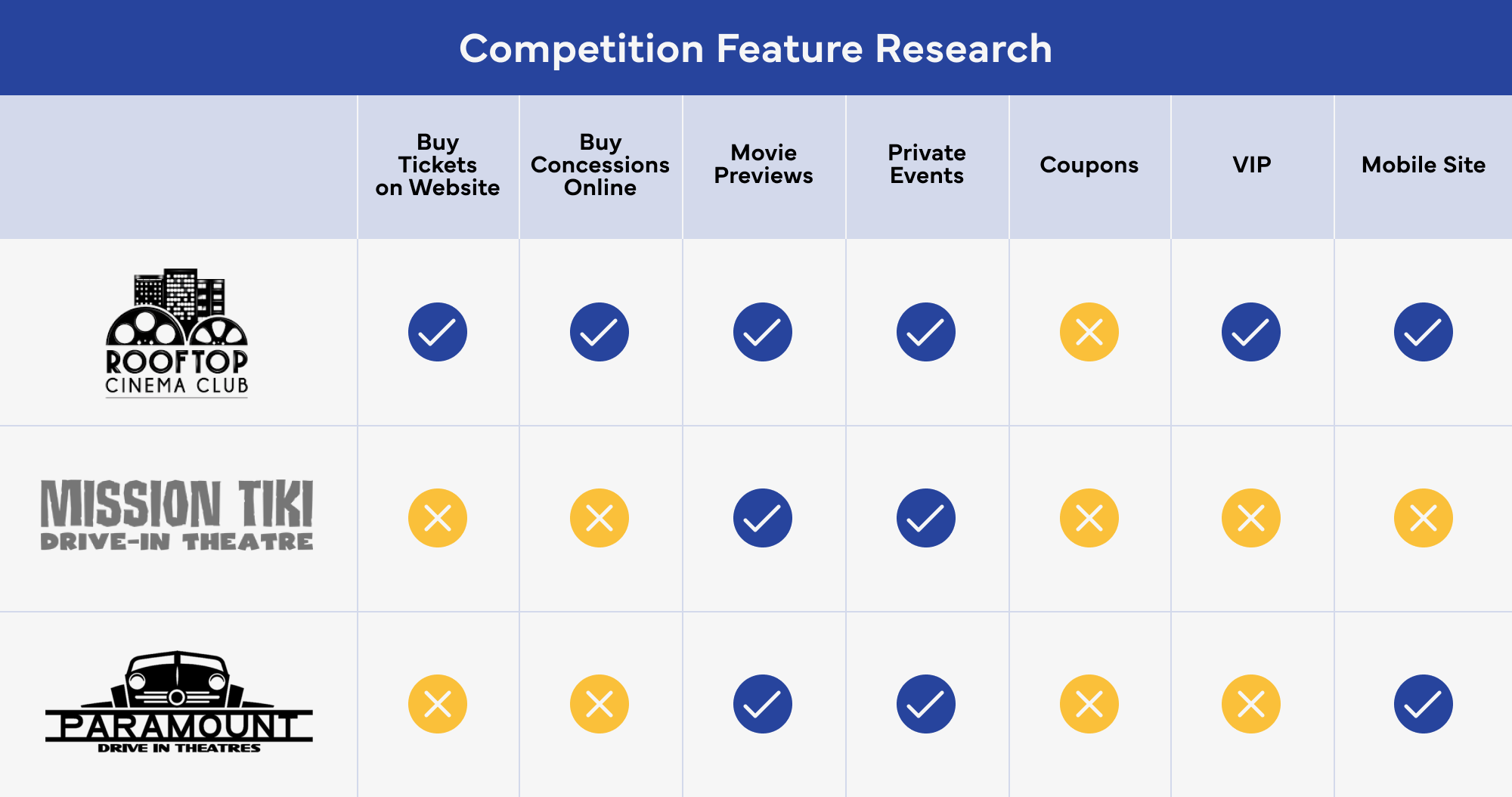
EMPATHIZE: Comparative ReSEARCH
Understanding the website features of other movie venues
A large part of our research was devoted to the the website features of competitors in the same industry. We did a feature inventory of three companies. These included Rooftop Cinema Club, Mission Tiki, and Paramount Drive-In. The major takeaway from this analysis was the movies needed to be the star, the inclusion of the ticket details throughout the checkout flow, and the effortless transition from finding events to a ticket purchase.
Key takeways from the competitor research
- Movies needed to be the primary focus
- The Electric Dusk navigation needed to be more intuitive
- Helpful when the website works well on a mobile device.
DefinE: User GOALS
How can we help our user?
- Movies need to be front and center, right now it is too hard to find showtimes.
- Roll fees into prices so there’s no extra fees at the end.
- Include concessions as part of the checkout process, not as a separate process.
- Make the navigation and clearer so they can find what they need faster.
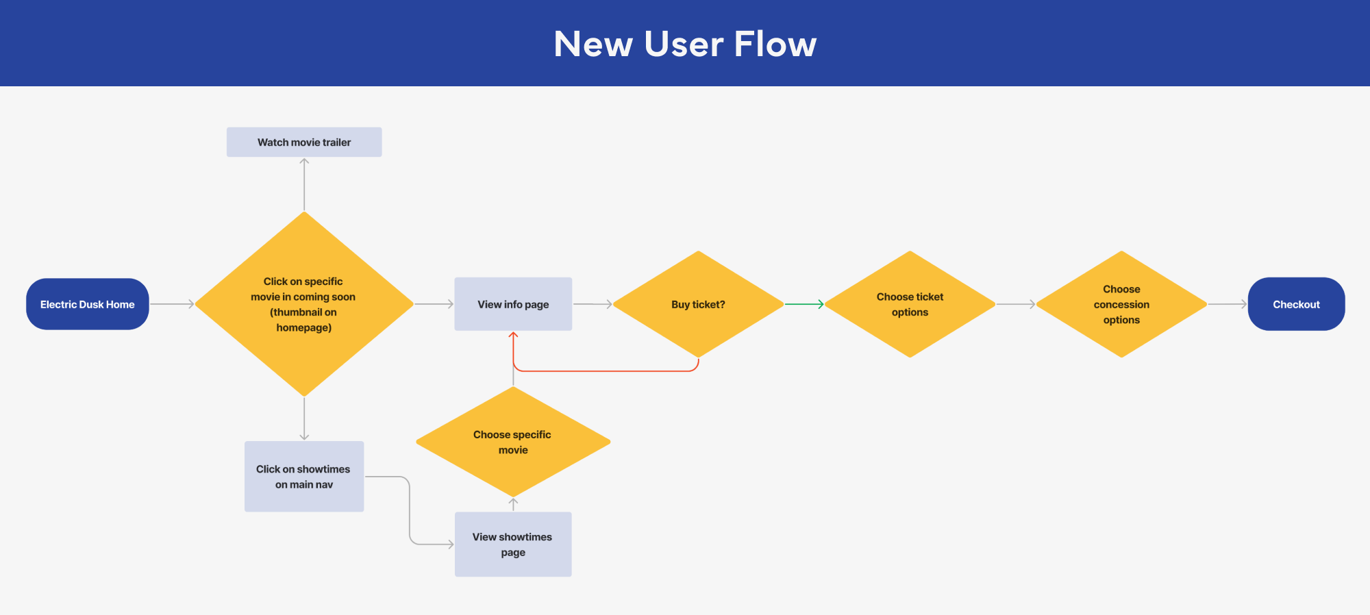
IDEATE: USER FLOW
Helping customers find showtimes and get their tickets in a few clicks
During our user interviews customers were getting frustrated locating movie times and leaving the site to checkout. In the revised user flow our users could view showtimes from the home page and get to the ticketing stage in one step.
IDEATE: DeSIGN WORKSHOP
Ideating new solutions to help Electric Dusk customers use the site with ease
During our design workshops we focused on a few key areas.
- Making the movies and trailers easy to find
- Adding clarity to the ticket options
- Adding concessions to the checkout process
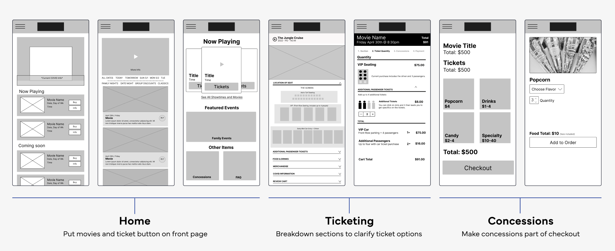
ProTOTYPE AND TEST
Testing the new website
After designing features that would help solve our users problems. It was time to put it all together and see if our users would be able to navigate through the app. We tested them on four tasks:
- Find a specific movie
- Find VIP Tickets to that movie
- Add additional tickets/seats to your order
- Add concessions to your order and checkout
Key takeways from the prototype test
- Testers spent less than 6 seconds on each screen, the prototype was easy to navigate.
- No carts were abandoned. The checkout process was easily completed.
- One user stated: “Didn’t have to spend a lot of time to find what I needed to proceed. I honestly didn’t even read a lot of what was on screen, it was that easy.”
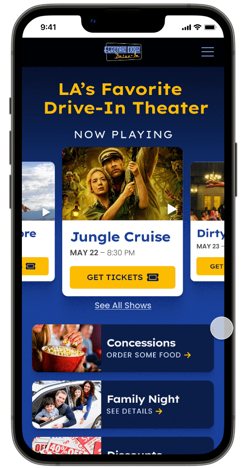
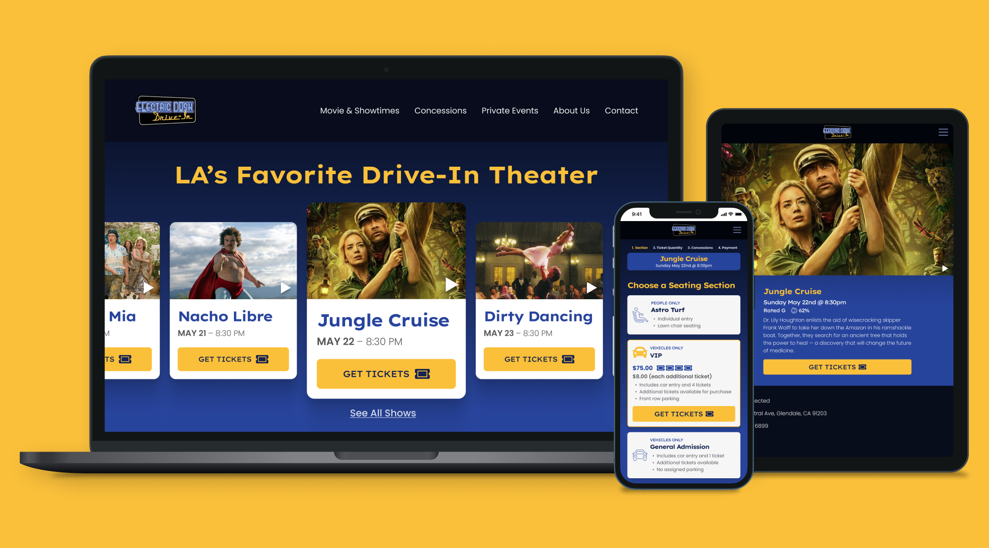
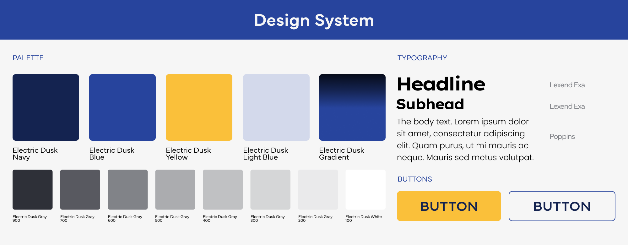
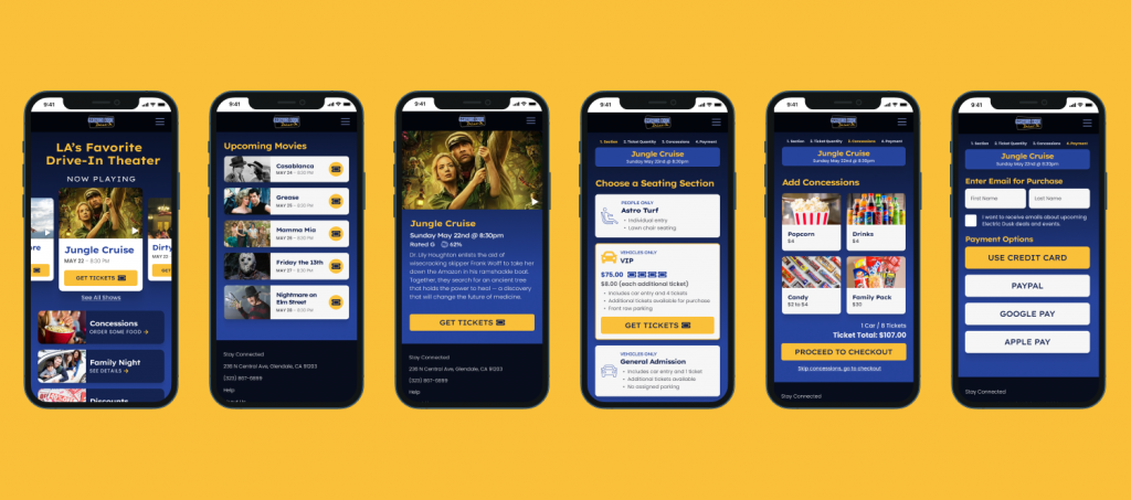
DESIGN
Final website designs
The client no existing branding to speak of. We chose a color palette based on the clients existing logo and created a simple design system so all screen designs were consistent. We made the designs modular in nature so they could adapt to multiple screen sizes. There was little iterations from the prototype phase, so we went straight to high-fidelity mockups.
Takeaways and next steps
Doing a usability test with the existing site made the users struggles very obvious, it felt like it was the fastest way to uncover real issues and feelings. Due to the amount of time allotted to the project, we only did testing on our mobile design. Although the site design was responsive and similar in design, going forward I would test all sizes of the site.