Education Walkthrough is an education technology company that allows administrators to record and score observations within the classroom. These observations are called walkthroughs.
About the project: Modifications for Education Walkthrough, a web and mobile application.
My role: Product Designer
Tools Used: Figma
Timeline: Ongoing
Problem Discovery
Understanding user frustrations
Users were struggling with the amount of information required during product registration. Additionally, users were not trying using the product following registration. This information was discovered using analytics and site recordings from the application, and confirmed during founder interviews.
Key takeaways from problem discovery
They were overwhelmed with the amount of information required during registration.
Following the registrations, users failed to experience the product.
Additionally I noticed, design inconsistencies and established some design standards to unify the product.
DESIGN SOLUTIONS
Reducing account creation friction
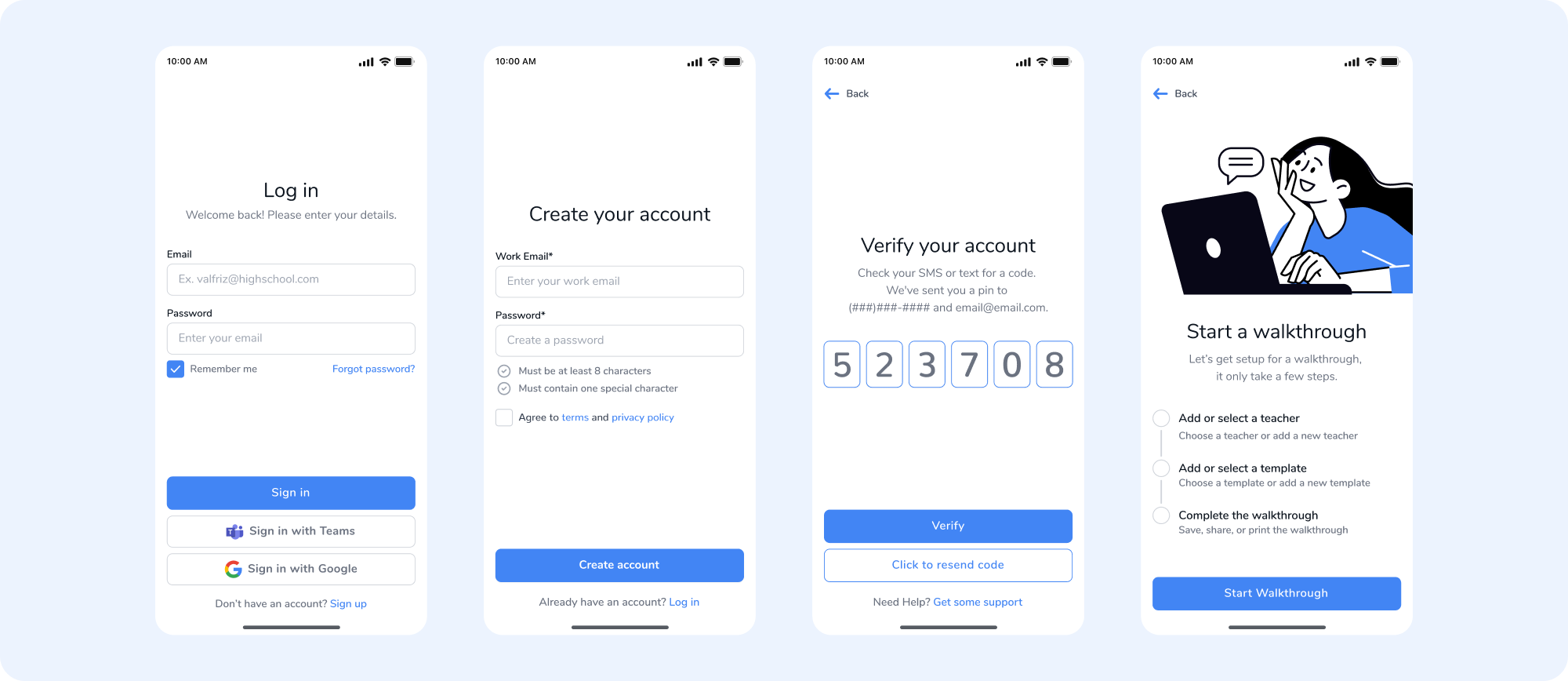
The original sign up flow required ten form fields to create an account, plus verification. After the redesign the fields were reduced to two. We decided to only capture necessary information, including a work email and password. The remaining fields of information could be captured in an account setup after joining.
DESIGN SOLUTIONS
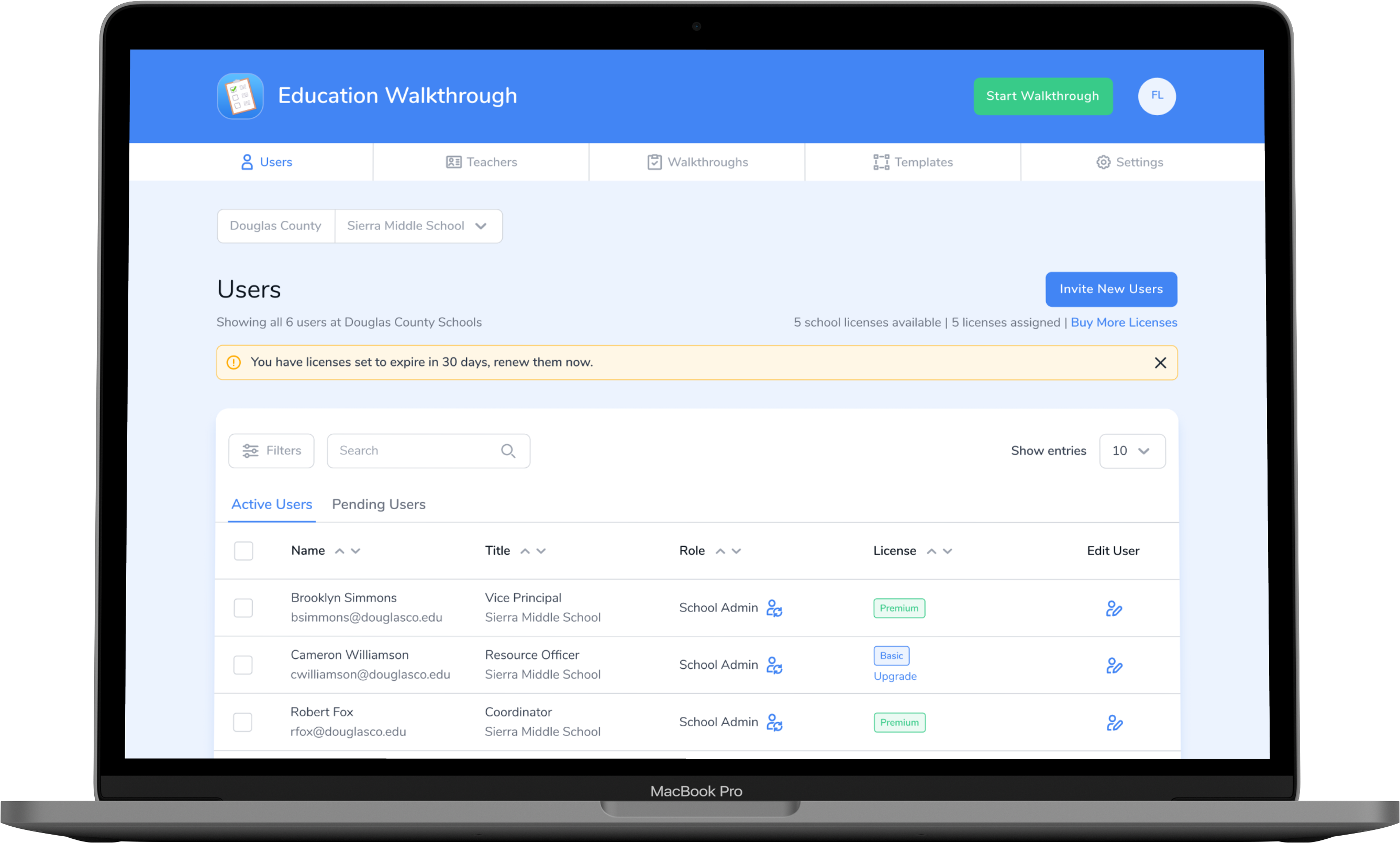
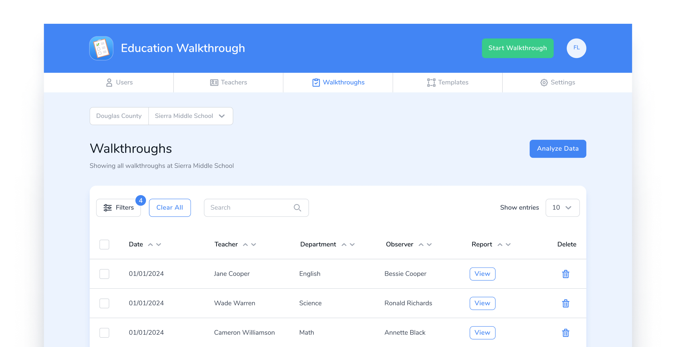
Organizing walkthrough information
The walkthroughs are captured inside a table, and collect many types of metadata. Previously the data had no search functionality or filters. We reduced the number of columns to reflect the most important data, plus incorporated a search bar, and table filters. This made it easier for users to find the information they were looking for.
DESIGN SOLUTIONS
Creating a design standard
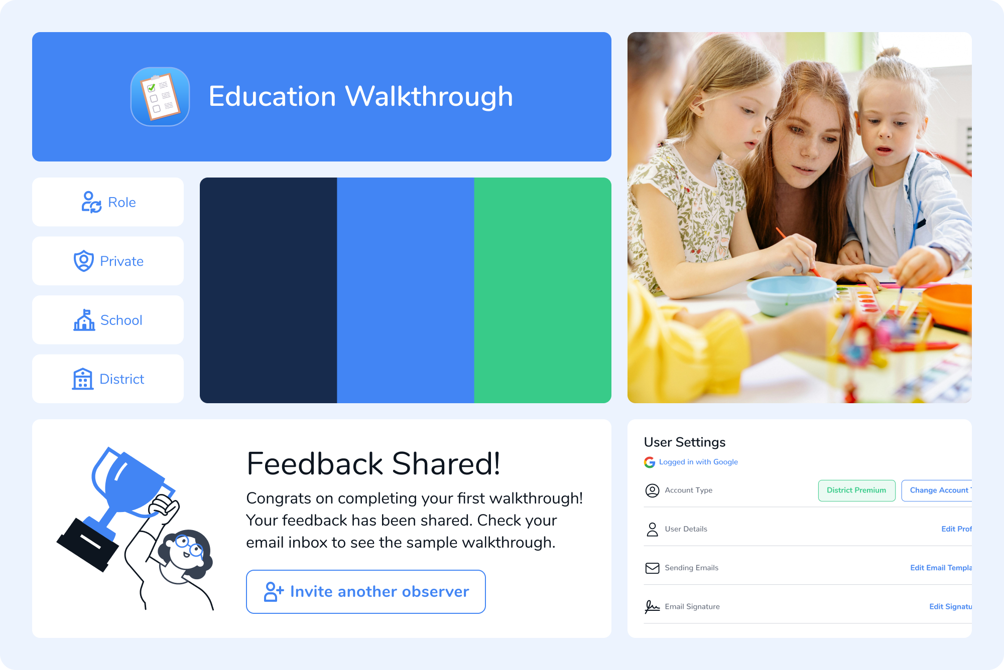
When I joined the Education Walkthrough team, there had been many screens developed over time, and they had lost their sense of consistency. I reduced the typography to a single font with a few weights. I picked a few secondary colors based on the blue used on the app icon. Additionally I chose an icon set that was versatile and consistent in style. From there I created reusable components as needed.