CASE STUDY
PimsPoints mobile application redesign
PimsPoints is an app that rewards parents with points for being involved in their child’s education. PimsPoints users can receive messages from their child’s school, participate in polls, and view/sign and return documents securely in exchange for points. These points can be redeemed for coupons and discounts to local businesses .
- About the project: This was a project for General Assembly UI/UX Design Immersive.
- My role: I was one of three UI designers. I focused mainly on the mobile screen designs.
- Team: Janina L. (illustrations), Tarine W. (animation), Nichole S. (research), and Savannah J. (research)
- Tools Used: Figma, Maze, Photoshop
- Timeline: 4 weeks.
The Problem: Parents were not using the PimsPoints app
Stakeholders created the application in order to ensure parents were engaged in their children’s education. However, there was one big problem: parents weren’t using the app.
Stakeholders wanted us to introduce gamification into the platform in order to keep parents engaged.
EMPATHIZE: USER RESEARCH
Discovering why parents aren't using the PimsPoint app
We wanted to understand why parent engagement was low. We also wanted to discover their primary motivations behind parent involvement. So we conducted ten user interviews of parents that are using the PimsPoint app. What we learned is:

Parents were overwhelmed with communications from the school, they would prefer one central communication tool.

Parents also said their primary motivation to be involved was to see kids have success in school. Any rewards were secondary.

Parents did not understand what rewards were available.
DEEFINE: PERSONA GOALS
Changing the product focus
Stakeholders wanted us to introduce gamification into the platform in order to keep parents engaged on the app. But based on our interviews they were not going to use the app solely for the rewards. However, if there was essential information being delivered from the school or teacher they would use it more frequently. Therefore the product needed to focus on communications first and rewards second.
Pivoting from parent rewards to parent communications
The stakeholders objectives wanted to be focus on gamification as the solution to parent enagement, and while that was was important, it was clear the primary functionality of the app should focus on school communications.
By creating a one-stop-shop center of communication with the added incentive of earning points for rewards for completing school tasks, PimsPoints would become the primary resource for parents, teachers, and admin to stay in contact regularly and participate in school activities.
Moving into design, we decided to focus on solving three big problems. They were:
- Centralizing the communications for the school into a central hub or dashboard type feature.
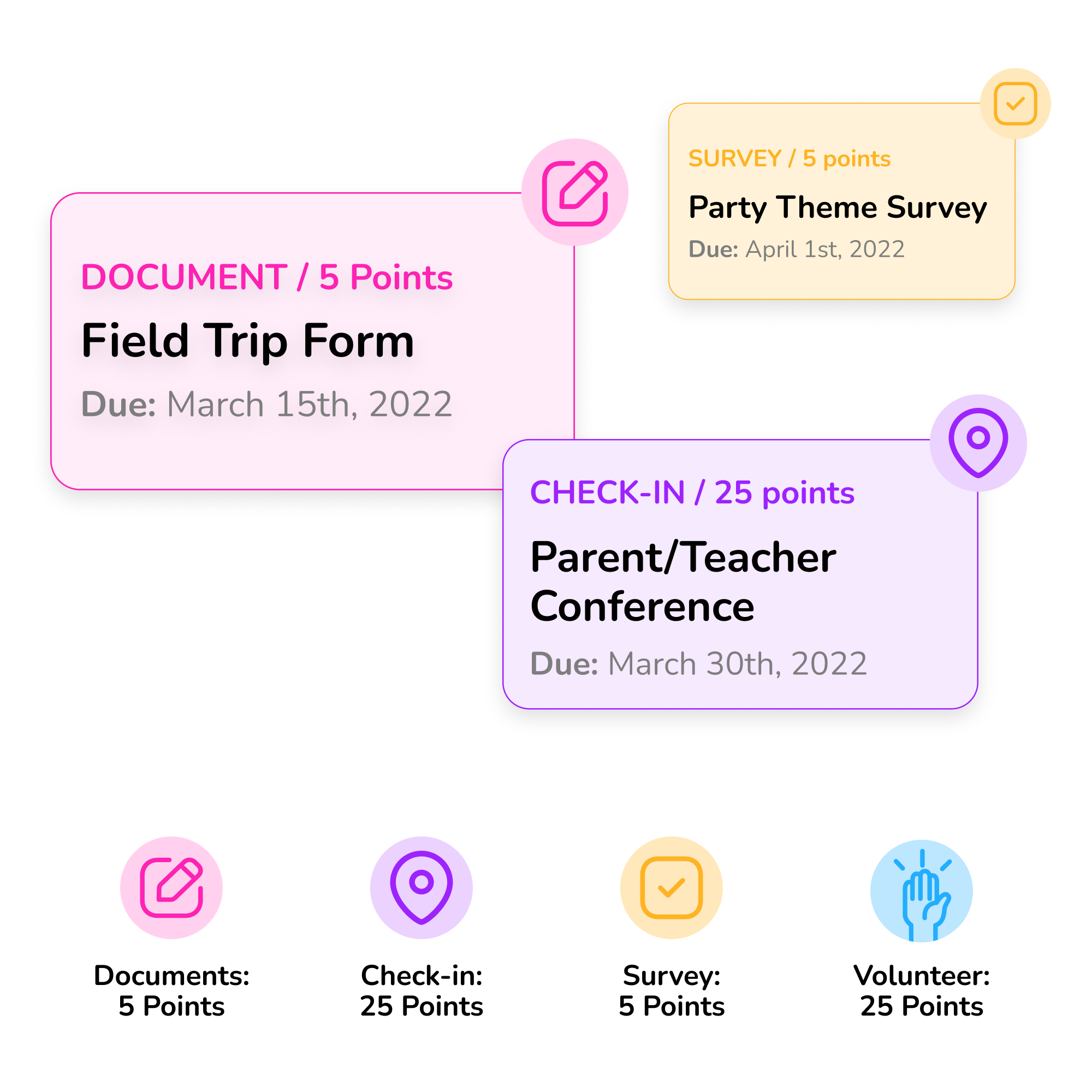
- Adding a gamification system to increase parent engagement while keeping communications at the forefront. Parents are rewarded with points by completing certain to-do’s, this needed to be featured.
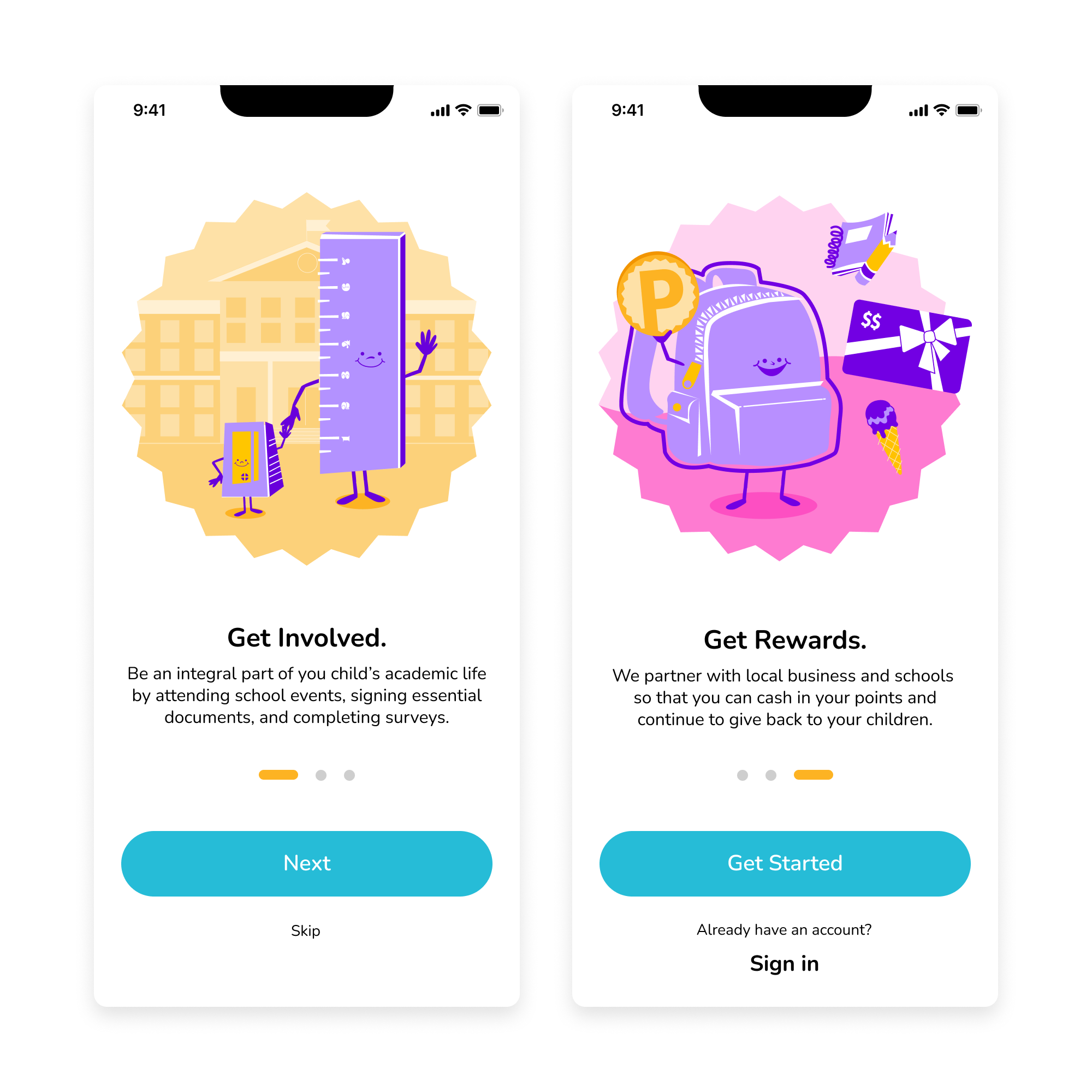
- Adding an onboarding sequence so parents had a better understanding of PimsPoints functionality and benefits.
IDEATE: DESIGN
Ideating new solutions to help parents stay engaged

Creating an onboarding flow to educate parents
During our user interviews, we discovered parents really didn’t understand the points part of the app, nor what rewards were available to them. We wanted to create a flow that spelled out the benefits of using the app, plus we rewarded users for signing up hoping that getting them involved and giving them rewards from the beginning stages would build momentum for using the other parts of the app.

Creating a central hub for school comms
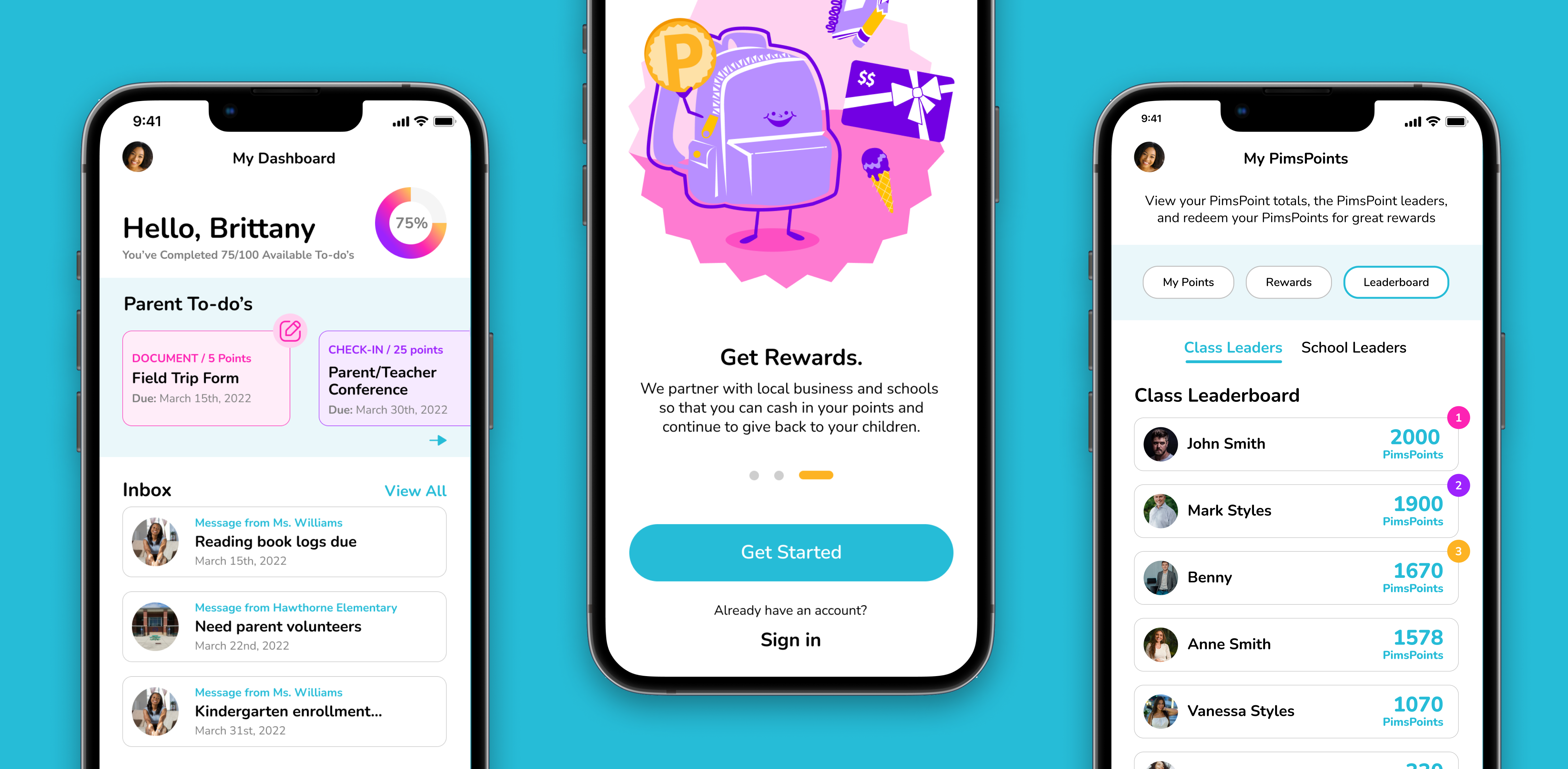
The app was already designed as a communication tool, however we made switched the home page from a reward focus to a communications and to-do hub. Here users could see messages at a glance, and jump to important to-do’s from their child’s school and teacher.

Adding gamification elements to the interface
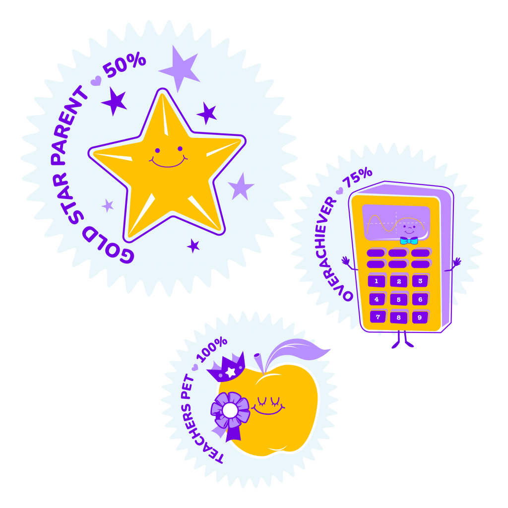
In order to gamify the app, we decided on a set of rules for acquiring the points. The stakeholders had started to develop a point system, we took this framework and we created the rules of the game. We created a tiered point system that rewarded users set amount of points for certain to-do’s within the app. The parents would level up and down based on their level of completion, with the primary goal to always be at 100%. We included badges as a reward for meeting these requirements.
PROTOTYPE AND TEST
Testing the new primary functions with parents
We completed a remote, unmoderated test to discover if our new design solutions were on track. Here were the four scenarios we tested:
Checking a new message from a teacher
Parents could check messages from their To-do section or the messages tab.
Checking in at a parent-teacher conference
Parents to earn points when completing to-do’s. In this
to-do example we had parents check into a parent-teacher conference.
Checking PimsPoints earned
We completed a remote, unmoderated test to discover if our new design solutions were on track. Here were the four scenarios we tested:
Redeeming earned points for a reward
Once parents have collected enough points they can redeem their points in exchange for a gift card or discount to a local business. This is where parents can finally cash in all their participation points.
Takeaways and next steps
Now that the parent application is complete, it’s time to roll it out to the school districts to see how the redesign is received by parents.
In our usability testing, a user did mention that it would be nice to see it in Spanish. PimsPoints could work to implement other language capabilities to make it more accessible to families.
Finally, PimsPoints is looking to create a PimsPoints Junior app for the students to earn points alongside their parents
